

A training metrics dashboard is a live, decision-ready view of four outcome metrics — one per Kirkpatrick level — that tells you whether training actually changed behavior and moved a business result. If your current dashboard shows completion rates and hours logged, it is measuring activity, not effect.
The four metrics every dashboard must show:
- Reaction score (Level 1): post-session satisfaction or perceived relevance rating
- Learning gain (Level 2): pre-to-post assessment score delta
- Application rate (Level 3): observed behavior change at 60–90 days
- Organizational result (Level 4): movement on one business metric tied to the program
The most common misstep is building a dashboard around what is easy to pull from the LMS rather than what answers a stakeholder's question. Completion rate belongs in an operational log, not a leadership view.
Next step: pick one program, instrument all four metrics, and run a single cohort as a pilot before scaling the dashboard.
Pro Tip: Start with the Level 4 metric first. If you cannot name the one business number the program is supposed to move, the rest of the dashboard has no anchor.
Key Takeaways
A training metrics dashboard only drives decisions when it tracks four outcome-focused metrics tied to Kirkpatrick Levels 1–4, refreshes per cohort, and gives each audience the right level of detail.
| Point | Details |
|---|---|
| Use four Kirkpatrick-linked metrics | Track reaction, learning gain, application rate, and one business result — drop completion and hours logged. |
| Instrument data before the cohort starts | Capture the Level 4 baseline and deploy pre-tests on day zero; retroactive baselines are unreliable. |
| Pilot with one program first | Validate data completeness, accuracy, and stakeholder sign-off before scaling to multiple programs. |
| Design for the audience, not the data | Executives need one tile per level; managers need a participant drilldown; L&D needs quality flags. |
| Callflow as a data source | Callflow's instant grading and supervisor exports supply Level 1–3 dashboard data from the first session. |
Table of Contents
- What is a training metrics dashboard?
- Why tracking training metrics matters for business outcomes
- Core metrics to track, mapped to the Kirkpatrick model (Levels 1–4)
- How to choose the right metrics for each program
- Common data sources and integration patterns
- Design principles and UX patterns for dashboards that get used
- Concrete dashboard examples and widget inventory
- Step-by-step build and deployment plan
- Tools and implementation options
- Common pitfalls and immediate actions when metrics look bad
- How an AI role-play platform feeds a high-impact dashboard
- What practitioners get wrong about dashboard design
- Callflow gives your dashboard the data it needs from day one
- Sources
What is a training metrics dashboard?
A training metrics dashboard is a centralized, continuously refreshed display that translates raw training data into the four or five numbers a decision-maker actually needs. It is not a report, and it is not an LMS export. A report is a snapshot pulled on demand; a dashboard recomputes as cohorts complete and follow-up data arrives, so the picture is always current.
The distinction matters because stale quarterly snapshots arrive too late to fix a failing program. Live dashboards and early indicators let teams course-correct while a program is still running, rather than after the quarter ends.
Who uses it and what they need:
- L&D team: program-level learning gain, assessment score distributions, cohort completion timelines, and data-quality flags
- HR managers: workforce-wide skill coverage, time-to-proficiency by role, and training ROI tied to retention or performance reviews
- Frontline managers: team-level application rates, individual participant scores, and alerts when a rep falls below a threshold
- Executives: one number per Kirkpatrick level for the highest-priority programs, trend lines, and a clear line to a business outcome
Think of the dashboard as two layers: an outcome summary at the top (the four live numbers) and drilldowns underneath (cohort detail, individual records, data-quality logs). Raw LMS exports and operational reports live in a separate layer that only the L&D team needs to see regularly.
Why tracking training metrics matters for business outcomes
Gartner's survey data shows that 85% of L&D leaders expect a surge in skills development needs driven by AI and digital transformation over the next three years. That pressure makes measurement non-optional: when the volume of training programs grows, leadership needs a way to prioritize which ones to fund, scale, or cut.
An outcome-focused dashboard changes three decisions that activity metrics cannot:
- Faster interventions: a live application-rate tile that drops below target mid-cohort triggers a coaching conversation before the cohort closes, not six weeks later
- Program prioritization: comparing learning gain across programs shows which content design actually works, so budget follows evidence rather than vendor relationships
- ROI conversations: a single Level 4 tile showing movement on a named business metric (call resolution rate, error rate, revenue per rep) gives a CFO something to act on
Consider a concrete scenario: a contact center runs a new objection-handling module. Two weeks in, the dashboard shows a reaction score of 4.2 out of 5 but a learning gain of only 8 percentage points. That gap, visible in real time, tells the L&D lead the content is liked but not teaching. The team revises the assessment design and adds a practice scenario before the next cohort starts. Without a live dashboard, that finding would surface in a quarterly review after three cohorts had already run.
Selecting only the metrics that answer stakeholder questions is what separates a dashboard leadership trusts from one they ignore.

Core metrics to track, mapped to the Kirkpatrick model (Levels 1–4)
The Kirkpatrick training evaluation model gives every metric a purpose: reaction tells you whether learners found the program credible, learning gain tells you whether knowledge transferred, application tells you whether behavior changed on the job, and the organizational result tells you whether the business moved. Completion rate and hours logged answer none of those questions, which is why they belong in operational logs rather than outcome dashboards.
Metric taxonomy with calculation and cadence
| Metric | Kirkpatrick Level | Example Calculation | Cadence | Decision It Informs |
|---|---|---|---|---|
| Reaction score | Level 1 | Average post-session rating (1–5 scale) | Per session | Content relevance; facilitator quality |
| Learning gain | Level 2 | (Post-test score − Pre-test score) / Pre-test score × 100 | Per cohort | Knowledge transfer; assessment design quality |
| Knowledge retention | Level 2 | Retention quiz score at 30 days vs. post-test score | 30 days post | Spaced reinforcement need |
| Application rate | Level 3 | % of participants observed applying skill at 60–90 days | 60–90 days post | Transfer design; manager reinforcement |
| Time to proficiency | Level 3 | Days from training start to first independent performance milestone | Per cohort | Ramp efficiency |
| Organizational result | Level 4 | Target metric (e.g., resolution rate) vs. pre-training baseline | Quarterly | Business ROI; program continuation |
Kirkpatrick level mapping: outcome metrics vs. vanity metrics
Measurement notes and sample formulas:
- Learning gain: subtract the pre-test score from the post-test score, divide by the pre-test score, and multiply by 100. A gain of 25% or more is a reasonable pilot target for a well-designed module.
- Application rate (60–90 days): send a structured observation checklist to the participant's direct manager at day 60. Count the number of participants rated "applying consistently" divided by total participants who completed training. Aim for a response rate above 70% before treating the number as reliable.
- Level 4 metric selection: pick one organizational metric the program explicitly intends to move. For a sales training program, that might be average deal size or first-call resolution rate. For a compliance program, it might be audit error rate. Tracking that single metric against a pre-training baseline with clear attribution logic is what makes the Level 4 tile credible to a CFO.
The forgetting curve is the reason a 30-day retention check belongs on the dashboard alongside the immediate post-test. Knowledge decay is predictable; a dashboard that only shows post-test scores misses whether learning actually stuck.
How to choose the right metrics for each program
Not every program needs all six metrics from the taxonomy above. The goal is to pick 1–3 metrics per level that map to a real decision, and only include metrics you can actually measure with data you already have or can instrument within the pilot timeline.
Step-by-step checklist:
- Define the desired business outcome. Write one sentence: "This program should move [metric] from [baseline] to [target] within [timeframe]." If you cannot complete that sentence, the program scope needs clarification before measurement begins.
- Map it to a Kirkpatrick level. A business outcome is Level 4. Work backward: what behavior change (Level 3) would produce that outcome? What knowledge (Level 2) enables that behavior? What learning experience (Level 1) delivers that knowledge?
- Select 1–3 metrics per level that map to decisions. More metrics do not produce more clarity. A well-designed dashboard tells a clear story by focusing on the numbers that matter for each audience.
- Validate data availability. For each metric, identify the source system, the owner, and the extraction method. If the data does not exist or requires a manual process that will not scale, either instrument it before the pilot or drop the metric.
- Set targets and assign ownership. Every metric needs a target (even a provisional one for a pilot) and a named owner who is responsible for data quality and interpretation.
Questions to ask data owners and stakeholders:
- Is participant data tied to a persistent ID that exists in both the LMS and the performance system?
- How often is this data updated, and who owns the refresh?
- Can we get a pre-training baseline for the Level 4 metric before the cohort starts?
- Who will conduct the 60-day manager observation, and what form will they use?
Target-setting for pilots: use industry benchmarks loosely and internal baselines tightly.
Common data sources and integration patterns
Building a KPI framework starts with identifying your data sources: LMS data, assessments, surveys, and HRIS are the primary layer; performance systems and CRM data feed Level 3 and Level 4.
Source list by metric:
- LMS data: completion status, time-on-module, login frequency, course enrollment. Feeds operational logs and Level 1 context. Many platforms offer learning management features and export patterns via API or scheduled CSV.
- Assessment tools: pre-test and post-test scores, quiz results, simulation scores. Primary source for Level 2 learning gain.
- Survey platforms: post-session reaction surveys (SurveyMonkey, Qualtrics, Google Forms, or LMS-native surveys). Primary source for Level 1 reaction score.
- LRS/xAPI: captures granular learning events (attempts, scores, durations, completions) from any xAPI-compliant content. Enables cross-platform participant tracking when the LMS alone is insufficient.
- HRIS: employee role, tenure, department, and performance review data. Needed to segment Level 3 and Level 4 metrics by team or role.
- Performance management systems: manager ratings, goal completion, performance review scores. Secondary source for Level 3 application evidence.
- CRM and operations systems: revenue per rep, resolution rate, error rate, deal size. Primary source for Level 4 organizational results.
Integration patterns:
- Direct API: preferred for real-time refresh. LMS and survey platforms with REST APIs can push data to a BI tool or data warehouse on a schedule.
- LRS/xAPI statements: use when content is distributed across multiple platforms. An LRS aggregates events by participant ID and exposes them via a standard query interface.
- Scheduled CSV exports: lowest-effort starting point for pilots. Set a weekly export from the LMS and assessment tool, load into a spreadsheet or BI tool, and refresh manually until volume justifies automation.
- Event streaming: for high-volume contact center environments, streaming integrations (via tools like Zapier, Fivetran, or custom webhooks) keep the dashboard current without manual intervention.
Data-quality checklist before going live:
- Every participant has a persistent ID that matches across the LMS, survey tool, HRIS, and performance system
- Course and program names follow a consistent naming convention (no "Sales Training v2 FINAL FINAL" variants)
- Timestamps are in a single timezone and format
- Each metric has a named owner and a documented refresh cadence
- Pre-training baseline values are captured before the cohort starts, not reconstructed afterward
Design principles and UX patterns for dashboards that get used
A dashboard no one opens is a reporting exercise, not a decision tool. The design choices that determine whether a dashboard gets used are simpler than most teams expect.
Role-view checklist:
- Executives: one tile per Kirkpatrick level for the top 2–3 programs, a trend line showing movement over the last three cohorts, and a single Level 4 number vs. baseline. No individual participant data.
- L&D leads: program-level learning gain distribution, cohort completion timeline, data-quality flags, and a drilldown to assessment item analysis.
- Frontline managers: team-level application rate, a participant list with individual scores, and an alert when a team member falls below the threshold for a critical skill.
Visualization guidelines:
- Single-number tiles: use for the four Kirkpatrick-level metrics on the executive view. One number, one label, one comparison (vs. target or vs. prior cohort).
- Trend lines: use for metrics tracked across multiple cohorts (reaction score over time, learning gain by program version). A 3–6 cohort window is usually enough to show a meaningful pattern.
- Distribution charts: use for learning gain and assessment scores to show whether the cohort improved uniformly or whether a subset of participants is pulling the average down.
- Drilldowns: link every aggregate tile to the underlying participant-level records. Out-of-the-box integrations and single-record scoring let teams drill from an aggregate metric to the individual record that drove it, which is where root-cause analysis actually happens.
The playbook does not need to be elaborate: a checklist of three interventions (manager coaching conversation, spaced reinforcement module, peer practice session) is enough to give the alert a next step.
Pro Tip: Each cycle, identify the single metric that most directly predicts your Level 4 outcome and make it the largest, most visible tile on the dashboard. Everything else is context.
Concrete dashboard examples and widget inventory
Two layouts cover most use cases: an executive summary page and a manager view. Both pull from the same data; the difference is granularity and audience.
Widget inventory
- Reaction tile: average post-session rating (1–5), current cohort vs. prior cohort delta
- Learning gain tile: average pre-to-post score delta (%), distribution histogram
- Application funnel: % of participants at each stage (completed training → observed applying → applying consistently)
- Org metric tile: Level 4 business metric vs. pre-training baseline, with trend line
- Cohort drilldown: participant list with individual scores for each metric, sortable by learning gain or application status
- Data-quality flag: count of participants missing a pre-test score, a survey response, or a 60-day observation
Executive summary page layout
The top row shows four tiles: reaction score, learning gain percentage, application rate, and the Level 4 business metric vs. baseline. Below that, a single trend line shows learning gain across the last four cohorts. No participant names, no individual scores. The entire view fits on one screen without scrolling.
Manager view layout
The top row mirrors the executive tiles but filtered to the manager's team. Below that, a participant table lists each team member's pre-test score, post-test score, learning gain, and 60-day application status.
Spreadsheet prototype instructions
To simulate a cohort refresh, add a new tab for each cohort and use a summary tab that pulls the most recent cohort's values with an INDEX/MATCH formula. This gives you a live-ish view without a BI tool, which is enough to validate the metric design before investing in automation.
Step-by-step build and deployment plan
Implementation checklist
- Define scope: name the program, the cohort size, the pilot timeline, and the four Kirkpatrick metrics you will track.
- Map stakeholders: identify who needs the executive view, who needs the manager view, and who owns each data source.
- Instrument data: confirm pre-test, post-test, reaction survey, and Level 4 baseline are in place before the cohort starts. Capture the baseline Level 4 value on day zero.
- Build the prototype: use the spreadsheet template above. Populate it with one completed cohort's data (real or synthetic) to validate formulas and layout.
- Pilot with one cohort: run the dashboard live for one full cohort cycle, including the 60-day application follow-up.
- Validate: apply the acceptance criteria below before declaring the pilot successful.
- Scale: migrate to a BI tool or LMS-native analytics once the metric design is validated and data sources are stable.
Validation acceptance criteria for the pilot:
- Data completeness: at least 90% of participants have a pre-test score, a post-test score, and a reaction survey response
- Accuracy: learning gain calculations match a manual spot-check for 10 randomly selected participants
- Application follow-up: manager observation response rate is at or above 70% by day 75
- Stakeholder sign-off: at least one executive and one frontline manager confirm the dashboard answers their primary question
Rollout tips: schedule a monthly dashboard review cadence from day one, not after the dashboard is "finished." Assign a single metric owner for each tile. Archive any metric that has not informed a decision in two consecutive cohorts; a smaller, trusted dashboard beats a large one no one believes.
Tools and implementation options
| Approach | Pros | Cons | Best For |
|---|---|---|---|
| Spreadsheet prototype | Free, fast, no IT dependency | Manual refresh, no alerts, breaks at scale | Pilots, metric design validation |
| Built-in LMS analytics | Pre-integrated, no data pipeline | Limited to LMS data, fixed visualizations | Teams with one LMS and simple metric needs |
| BI platforms (Power BI, Tableau, Looker) | Flexible, multi-source, role-based views | Requires data engineering, licensing cost | Mid-to-large L&D teams with IT support |
| LRS-based analytics | Cross-platform xAPI data, granular events | Setup complexity, requires xAPI-compliant content | Distributed content environments |
| Specialized learning analytics platforms | Purpose-built for L&D, pre-built Kirkpatrick views | Higher cost, vendor lock-in | Enterprise L&D teams with budget |
Decision criteria checklist:
- How many participants per cohort, and how many programs run simultaneously?
- How often does the dashboard need to refresh (weekly, daily, real-time)?
- Do you have IT resources to build and maintain a data pipeline?
- Is your content xAPI-compliant, or are you dependent on LMS SCORM data?
- What is the budget for tooling, and does it include licensing and maintenance?
Move from a spreadsheet prototype to a BI platform when any of these conditions are true: you are running more than three programs simultaneously, your stakeholders need role-filtered views the spreadsheet cannot produce, or the manual refresh cadence is causing data to arrive more than a week late. Predictive modeling can extend a mature BI dashboard further, turning historical training signals into prioritized coaching interventions before performance gaps widen.
Common pitfalls and immediate actions when metrics look bad
A bad metric is a diagnostic signal, not a verdict. The first step is always to verify the data before acting on the number.
Troubleshooting checklist:
- Verify data integrity: check that participant IDs match across systems, that pre-test and post-test timestamps are in the right order, and that no cohort members are missing from the survey or assessment data
- Check cohort composition: a low learning gain average may reflect a cohort that already knew the material (high pre-test scores), not a content failure
- Examine learning design: low learning gain with high reaction scores usually means the content was engaging but not instructionally sound; review assessment alignment with learning objectives
- Confirm manager reinforcement: low application rates at 60 days often trace to managers who were not briefed on the expected behavior change, not to a training failure
Recommended interventions by failure type:
- Low reaction score (below 3.5/5): review facilitator delivery and content relevance; survey a sample of participants for specific friction points before the next cohort
- No learning gain (delta below 10%): audit the pre-test and post-test for alignment; if the assessment is valid, redesign the instructional sequence
- Low application rate (below 40% at 60 days): add a manager briefing before the next cohort, introduce a 30-day spaced reinforcement module, and schedule a peer practice session at day 45
- No Level 4 movement: check attribution logic first (was the cohort large enough and the timeframe long enough to expect movement?); if attribution is sound, examine whether the Level 3 behavior is actually the right lever for the business outcome
Communicating bad news to stakeholders: lead with the data, name the likely cause, and present one corrective action with a timeline. Assessment alignment is the likely cause. We are revising the post-test and will rerun the module with the next cohort in six weeks" is a complete stakeholder update. Avoid framing a bad metric as a program failure before the root cause is confirmed.
How an AI role-play platform feeds a high-impact dashboard
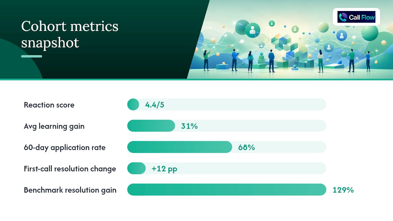
Callflow's AI role-play platform generates the simulation and assessment data that feeds Level 1, Level 2, and Level 3 tiles directly, without manual data collection.
Metric mapping from simulation to dashboard:
- Level 1 (reaction): post-simulation confidence rating and perceived realism score, captured in-platform after each role-play session
- Level 2 (learning gain): pre-simulation baseline score vs. post-simulation score across five graded performance dimensions (opening, discovery, objection handling, closing, and tone). The platform's instant grading produces a per-rep learning gain percentage that feeds the learning gain tile automatically.
- Level 3 (application): repeat simulation scores at 30 and 60 days, combined with supervisor observation data exported from the platform's supervisor dashboard, feed the application funnel widget
Sample cohort summary for a Callflow-powered dashboard:
A 20-rep sales cohort completes five AI mock call scenarios over two weeks. The dashboard shows: reaction score 4.4/5, average learning gain 31%, 60-day application rate 68% (based on supervisor dashboard exports and a structured manager observation at day 60), and first-call resolution rate up 12 percentage points vs. the pre-training baseline.
Implementation notes:
- Callflow assigns a persistent user ID per rep. Map this ID to the HRIS employee ID before the cohort starts so simulation scores, supervisor ratings, and CRM performance data can be joined in the dashboard.
- Timestamp alignment: export simulation scores with UTC timestamps and convert to local time in the BI layer, not in the export itself.
- For the 60-day application rate, use Callflow's AI mock call practice repeat-attempt data as a leading indicator (are reps voluntarily practicing?) alongside the manager observation as the confirmed measure.
- Callflow reports 147% faster ramp time and a 129% improvement in resolution rates across its customer base. Use these as benchmark targets when setting your Level 3 and Level 4 pilot goals, not as guaranteed outcomes for a single cohort.
What practitioners get wrong about dashboard design
Most L&D teams build dashboards backward. They start with what the LMS exports and work forward to a metric, rather than starting with the business question and working backward to the data. The result is a dashboard full of completion rates and hours logged that a CFO looks at once and never opens again.
The fix is not a better visualization tool. It is a better scoping conversation. Before any data is pulled, the L&D lead and the business stakeholder need to agree on one sentence: "We will know this program worked when [metric] moves from [X] to [Y] by [date]." That sentence is the Level 4 tile. Everything else on the dashboard exists to explain whether that number is moving and why.
A second thing practitioners underestimate: the 60-day application rate is the hardest metric to collect and the most important one to have. Reaction scores are easy and often misleading. Learning gain is measurable but only tells you what happened in the training room. Application rate is where the real story lives, and it requires a manager who was briefed, a structured observation form, and a follow-up process that someone owns. Most teams skip it because it is operationally inconvenient. That is exactly why dashboards built without it consistently fail to influence budget decisions.
Governance is the third gap. A dashboard with no named owner, no review cadence, and no process for retiring unused metrics becomes cluttered and untrustworthy within two cohort cycles. Assign one person to own each tile, schedule a monthly review, and archive any metric that has not changed a decision in 60 days.
Callflow gives your dashboard the data it needs from day one
Most training programs struggle to populate a Level 2 or Level 3 tile because the underlying data was never collected. Callflow solves that at the source. Every AI role-play session produces instant graded scores across five performance dimensions, a per-rep learning gain percentage, and supervisor dashboard exports that feed directly into your cohort view.
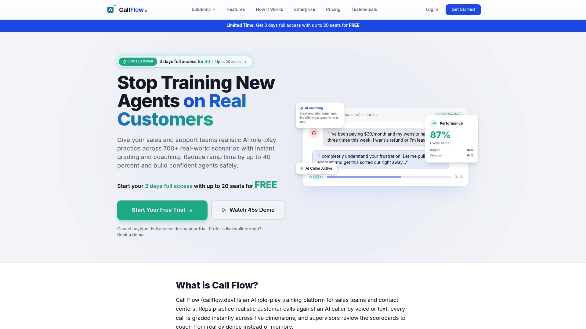
For sales teams and contact centers, that means your dashboard has real numbers from the first cohort: reaction scores from post-session ratings, learning gain from pre-to-post simulation scores, and application data from repeat-attempt trends and manager observations. The platform's sales coaching tools include configurable scenarios, gamification, and skill analytics that map cleanly to Kirkpatrick Levels 1–3 without custom instrumentation.
Start a free trial and run your first dashboard-ready cohort with no long-term commitment.