

Training data visualization, in the contact-center context, means building performance dashboards that track how fast agents ramp, how well coaching sticks, and where skill gaps persist. Start with three dashboards: a ramp and onboarding cohort dashboard, a coaching effectiveness and intervention dashboard, and a skill-gap heatmap with QA trends. Callflow reports 147% faster ramp time and 129% improvement in first-call resolution for teams that connect graded role-play metrics to these dashboards. Build those three first. Everything else is secondary.
- Ramp and onboarding cohort dashboard: tracks time-to-proficiency by hire cohort, onboarding funnel completion, and assessment score progression
- Coaching effectiveness dashboard: shows active coaching queues, pre/post QA score changes, and coaching completion rates
- Skill-gap heatmap and QA trends dashboard: maps competency scores by team and surfaces QA score distributions over time
Key Takeaways
Training data visualization for contact centers works when you connect graded role-play metrics to ramp, coaching, and QA dashboards and act on threshold alerts within a defined window.
| Point | Details |
|---|---|
| Build three dashboards first | Prioritize ramp and onboarding, coaching effectiveness, and skill-gap heatmap before adding any other views. |
| Cap KPIs at eight for launch | More than eight metrics in the initial build creates noise and slows adoption. |
| Set automated coaching triggers | If QA drops below 70% on any dimension for two weeks, auto-enroll agents and schedule a 1:1 within 72 hours. |
| Validate data sources before building | Confirm rubric version consistency and PII governance before connecting LMS, QA, CRM, and HRIS feeds. |
| Callflow supplies graded metrics directly | Callflow's AI grading and supervisor dashboards feed ramp and FCR KPIs with 147% faster ramp time reported by clients. |
Table of Contents
- What KPIs should your training data visualization include?
- Which chart type fits each training metric?
- How do you turn dashboard data into coaching actions?
- How do you roll out training dashboards in phases?
- What do the three priority dashboard templates look like?
- How does Callflow supply the metrics these dashboards need?
- What most teams get wrong about dashboard adoption
- Pilot Callflow and see the numbers move
- Sources
What KPIs should your training data visualization include?
Evaluating call center training programs requires tracking the right signals. Time-to-productivity commonly spans four to eight months without structured measurement. The table below defines each core KPI, how to calculate it, and which strategic question it answers.
| KPI | Operational definition | Calculation example | Strategic question answered |
|---|---|---|---|
| Ramp time | Days from hire date to 80% proficiency on core assessment | (Date of 80% score) minus (hire date) | How fast do new agents reach readiness? |
| Time-to-proficiency | Days to first passing QA score at or above threshold | (Date of first passing QA) minus (start date) | When is an agent safe to handle live calls? |
| Onboarding completion | % of required training modules completed by day 30 | Modules completed / modules assigned × 100 | Are agents finishing the curriculum on schedule? |
| Assessment score | Average score across graded role-play or knowledge checks | Sum of scores / number of attempts | Which agents need targeted coaching? |
| QA score | Quality assurance score per reviewed call | Rubric points earned / rubric total × 100 | Is call quality meeting the standard? |
| First-call resolution (FCR) | % of calls resolved without a callback or transfer | Resolved calls / total calls × 100 | Is training translating to customer outcomes? |
| Average handle time (AHT) | Average call duration including after-call work | Total handle time / number of calls | Is efficiency improving as agents ramp? |
| Coaching completion | % of assigned coaching sessions completed on time | Sessions completed / sessions assigned × 100 | Are managers following through on interventions? |
| Skill proficiency | Score per competency dimension from graded role-plays | Dimension score / max dimension score × 100 | Where are the specific skill gaps? |
| Agent retention contribution | % of agents retained at 90 days, segmented by cohort | Retained agents at 90 days / hired × 100 | Does training quality affect attrition? |
Pro Tip: Use cohort-level benchmarks rather than single-agent snapshots when making ramp decisions. One agent's outlier score can mislead; a cohort trend tells you whether the curriculum itself needs fixing.
Which chart type fits each training metric?
Matching the right visual to each KPI is where most dashboards fail. A bar chart of raw QA scores tells you almost nothing without context. Here is a numbered pairing list your analytics or dev team can implement directly.
- Ramp time and score progression: trend line chart, 90-day rolling window, filtered by cohort and supervisor. Drill path: cohort → individual agent → specific assessment attempt.
- Onboarding funnel completion: funnel chart showing step-by-step drop-off from module 1 to certification. Filter by hire date range and team. Flag any step with more than 15% drop-off.
- Cohort retention curves: survival-style line chart showing % of agents still active at 30, 60, and 90 days. One line per cohort. Useful for spotting whether a specific training class underperformed.
- Skill-gap heatmap: grid with competency dimensions on one axis and teams or supervisors on the other. Color intensity = average proficiency score. Immediately shows which competency is weakest across which team.
- QA score distribution: histogram showing the spread of QA scores across all reviewed calls in a period. A tight distribution near the top is good; a wide spread or left-skewed distribution signals inconsistency.
- Leaderboards: ranked table of cohorts or agents by composite score. Use for top/bottom identification, not for public shaming. Limit to supervisor view unless the team culture supports peer visibility.
- Resolution funnel: funnel chart from call received → handled → resolved on first contact. Tracks FCR visually and shows where transfers or escalations occur.
Do not display raw call counts without normalizing for call volume. Always show rates, not counts.
How do you turn dashboard data into coaching actions?
Reading a dashboard is step one. Acting on it within a defined window is what produces results.
- Cohort ramp decline: if a cohort's average assessment score drops more than 10 points week-over-week, review the most recent curriculum change or supervisor assignment. Schedule a cohort debrief within five business days.
- QA score drop: if a team's QA score falls below 70% on any single dimension for two consecutive weeks, auto-enroll affected agents in a targeted micro-coaching module and schedule a 1:1 within 72 hours.
- Persistent skill gap: if a competency dimension scores below 60% for a team across three consecutive measurement periods, flag it for curriculum revision rather than individual coaching. The problem is systemic, not individual.
- Coaching completion lag: if coaching completion falls below 80% for a supervisor, escalate to their manager with a summary report. Low completion is a leading indicator of future QA score declines.
- FCR plateau: if FCR holds flat despite improving QA scores, check whether the training scenarios match the actual call types agents are handling. A mismatch between practice content and live calls is the most common cause.
Pro Tip: Set up three notification channels per alert: an in-platform flag, an email digest to the supervisor, and a calendar invite for the coaching session. Alerts without a scheduled action get ignored.
Structured role-play cadences paired with AI-augmented metrics show that weekly practice sessions materially improve skill adoption when the feedback loop closes within 24 hours of the session.

How do you roll out training dashboards in phases?
| Phase | Duration | Key deliverables | Owners |
|---|---|---|---|
| Phase 1: Minimal viable dashboard | 4–6 weeks | KPI selection, data mapping, ramp and coaching dashboards live | Training lead, analytics |
| Phase 2: Integration and automation | 4–8 weeks | QA automation, alerting rules, LMS and CRM connectors | IT, analytics, training |
| Phase 3: Governance and iteration | Ongoing | Rubric version control, A/B tests on curriculum, access audits | Training lead, IT, ops |
Phase 1 checklist:
- Select no more than eight KPIs for the initial build. More than eight creates noise.
- Map each KPI to its source system and confirm the data exists and is clean.
- Build the ramp trend line and coaching completion panel first. These two views answer the most urgent operational questions.
- Run a user-acceptance test with two supervisors before broader rollout.
- Document access levels: supervisors see their team only; directors see all teams; agents see their own scores only.
Budget bands vary by scope. A small pilot covering one team of 10–15 agents typically requires minimal tooling cost if you use an existing BI layer. A mid-size rollout across 50–100 agents adds integration and QA automation costs. Enterprise deployments with real-time alerting and full LMS connectors require dedicated analytics engineering time.
What do the three priority dashboard templates look like?
Template A: Ramp and onboarding dashboard
- Cohort filter (hire month, supervisor, team)
- Trend line: average time-to-proficiency by cohort, 90-day window
- Funnel: onboarding steps from orientation to first passing QA
- Cohort comparison table: current cohort vs. prior two cohorts on ramp time and assessment score
- Drill path: cohort → individual agent → specific assessment attempt → graded transcript
Template B: Coaching and interventions dashboard
- Active coaching queue: agents currently in a coaching cycle, days since last session
- Improvement sparkline: QA score trend per agent over the last 30 days
- Pre/post QA panel: score before coaching intervention vs. score after, by competency dimension
- Schedule integration: next coaching session date pulled from calendar
Template C: Skill and QA heatmap
- Competency heatmap: rows = competency dimensions, columns = teams or supervisors, cells = average proficiency score
- QA score histogram: distribution of all reviewed calls in the selected period
- Sampled call links: low-scoring calls linked to transcript segments with the specific rubric failure flagged
Default filters for all three templates: time window (last 30/60/90 days), team, cohort, and scenario type. Common drill path across all three: cohort view → agent view → individual call or role-play session → coaching action log.
How does Callflow supply the metrics these dashboards need?
Callflow provides instant AI grading across multiple performance dimensions, skill proficiency scores by competency, coaching completion tracking, and supervisor dashboards out of the box. These outputs map directly to the KPIs in Template A, B, and C above.
Callflow clients report 147% faster ramp time and 129% improvement in first-call resolution compared to pre-platform baselines.
The platform feeds graded metrics via outbound data connectors, supports webhook-based alerts for coaching triggers, and connects to common LMS and CRM systems. For pilot evaluation, measure ramp time and FCR over a 60-day window with a cohort of 10–20 agents. Those two KPIs give you a clear signal on whether the platform is moving the numbers that matter.
What most teams get wrong about dashboard adoption
Dashboards fail when managers treat them as surveillance tools rather than coaching tools. The data does not change behavior. The conversation the data enables does.
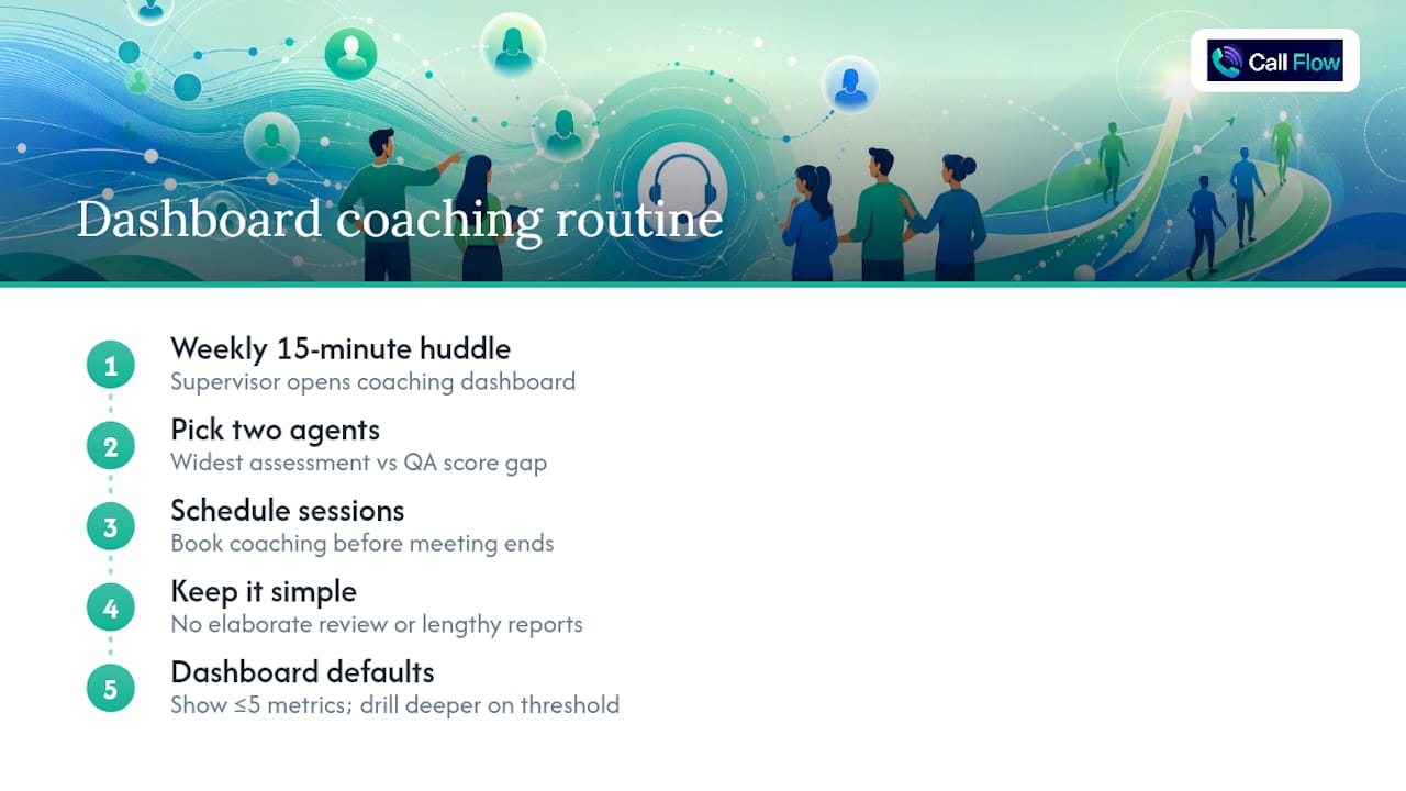
The teams that sustain dashboard-driven coaching share one habit: a weekly 15-minute huddle where the supervisor opens the coaching dashboard, picks the two agents with the widest gap between assessment score and QA score, and schedules a session before the meeting ends. No elaborate review process. No lengthy report. Just a consistent cadence that makes the dashboard part of the workflow rather than an extra task.
Dashboard fatigue is real, and it usually starts when too many KPIs are visible at once. Keep the default view to five or fewer metrics. Let supervisors drill deeper only when a threshold fires. The goal is to make the right action obvious, not to display everything you can measure.
Pilot Callflow and see the numbers move
Callflow gives contact centers and sales teams a direct path from role-play training to measurable dashboard results. The platform's AI grading feeds the exact KPIs your ramp and coaching dashboards need, with no manual scoring required.
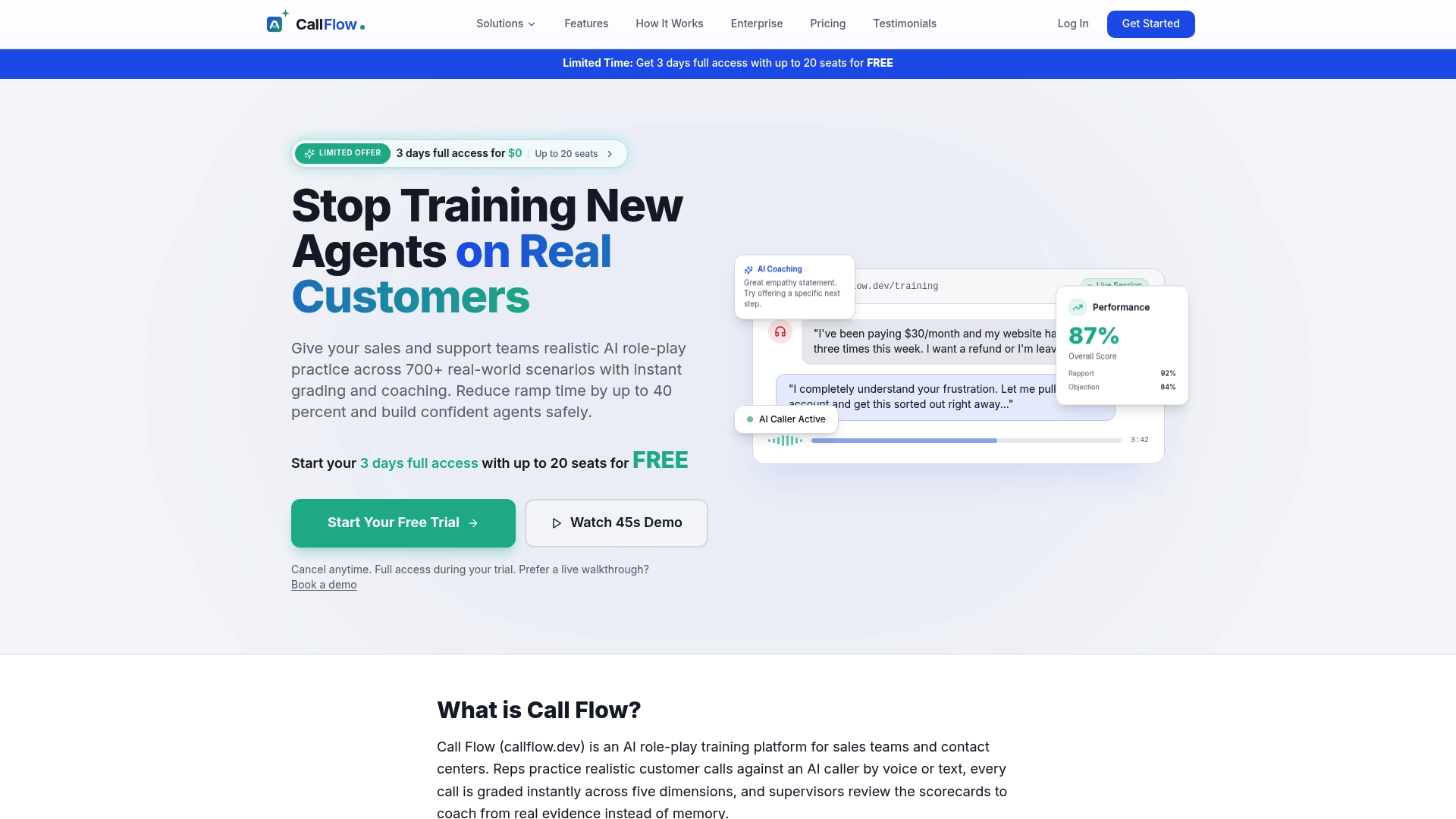
Start a pilot with 10–20 agents over 60 days. Measure ramp time and FCR as your two primary success KPIs. Connect Callflow's graded metrics to your existing BI layer or use the built-in supervisor dashboards to track progress. If the numbers move, expand. If they do not, you have 60 days of clean data to diagnose why.
Access the full platform during a risk-free trial. Visit Callflow to review pilot scope options and integration requirements.